Discussion

What will traceability look like?

Steven Flower
Steven Flower • 11 February 2016

Hi everyone

I’ve recently been working with UN-Habitat to investigate traceability: how we can link/connect different activities together.

There seems to be a growing community of people interested in this - including Pelle Aardema Herman van Loon and the team at the Dutch MFA (their guidelines are very useful), Rolf Kleef (really interesting post on org structures) and SJohns (fusion tables network diagrams)

system Admin - could we have a new dedicated category for traceability, maybe?

My question here is what shared understanding or experience we might have in terms of how traceability might “look”. If we tour around the uses of IATI thus far, there are plenty of maps, graphs and aggregations - most often centred on a single publisher (or all publishers, but aggregations around sectors or countries). As far as I know, we haven’t anything out there to illustrate what traceability between publishers would be/mean…

Network diagrams might be one tactic - as could a Sankey diagram:


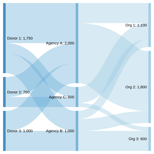
(made with Sankeymatic)

But - maybe we haven’t a clear idea, or full discussion, around what we are trying to do? Is it best to consider why we want traceability before rushing to the tools?

Hopefully others in the community can discuss. Apologies for the open end / vague nature of the post - I’ve been looking at network diagrams for far too long!

Comments (16)

Michael O'Donnell
Michael O'Donnell

Hi Steven

I’m a newbie to this forum, so hope I’m not too “back-to-basics”…

I’d break your question down from a user perspective:

  • Who is the user?
  • What question do they have which traceability information could usefully help answer?
  • Which visualisation would best provide or add insight to the answer?

Examples of traceability uses I seen include:

  • Broad constituency asking where the money pledged for humanitarian response has gone (need to track from donor to implementer, checking that all is accounted for compared to pledges, and with a desire to see who were the final recipients in the chain and then finding out how did they benefit; your Sankey diagram looks appropriate for that)

  • Citizens or recipient governments wanting to know more about aid projects in their area/ country, working from the bottom back to the original source; perhaps wanting to know who is behind certain work, how much of the original money reached the final “beneficiaries”, and perhaps wanting to comment on value-for-money and hold donors and implementers accountable for the quality of work. (a la Integrity Action’ Development Tracker, for example)

  • NGOs might want business intelligence for fundraising or partnership work (who’s working on this issue of interest for me in a particular country? which donors fund other organisations like mine to do that work? and can I gain access to and insights from any project documentation they’ve made available?); the Network Diagrams that Sarah Johns is looking at for us at Bond fits the bill for that.

  • Donors may want to be able to show taxpayers where their money ultimately goes to

I can envisage the answer to your question involving a matrix of visualisation tools mapped against utility for answering different user interests.

Best wishes, Michael

Yohanna  Loucheur
Yohanna Loucheur

In addition to the examples mentioned above (where I think the business intelligence one is particularly important), I would add: Donors may want to see who else is working with a given organization in the same project/program, the same sector, or in general.

Which leads me to suggest not so much an additional need per se, but a first attempt at unpacking the different meanings of “relationship”. We may want to know how many projects, or how much money, or some other dimension. Maybe we want to show all projects involving them, or only closed ones, or only those underway. Distinguish MO from CSOs, or other categories. Differentiate between disbursments and expenditures (with an assumption that disbursments should have at least one more organization in the chain, for the final expenditures). Presumably these various dimensions would all have a different “best” way to illustrate them, like Michael suggested.

Yohanna  Loucheur
Yohanna Loucheur

Ben, just to avoid confusion, the (very interesting!) exemple in the GHA is from Sri Lanka. Thanks for flagging it.

In terms of “what will traceability look like”, one thing that strikes me in the GHA example is that the outputs are shown to result strictly from the “activities” (which aren’t defined/described). Presumably, expenses like transport, security, logistic & overhead, staff etc are intrisic to the outputs being produced/provided/delivered. I’m concerned that this type of visual representation can make expenses appear less legitimate.

Chloe Parrish
Chloe Parrish

Hi everyone,

I developed the GHA traceability study that appeared in last year’s report - thanks Ben for flagging it. Yohanna I completely agree that many (all?) of those expenses you list are intrinsic to the delivery of the activities, and there’s certainly an argument for listing them all in the same way. In this example we were trying to make it as visually straight forward as possible, and to do so it was helpful for the explicit ‘activity’-related costs to be made to stand out somehow (in this case, in green). However in terms of the long-term vision for traceability through (IATI) data, this kind of categorisation is probably not necessary (or perhaps even desirable).

We’re actually currently working with Young Innovations in Nepal on a similar study, this time involving more reporters. The study initially came about as a result of, basically, Ben’s user question no. 1, following the earthquake. We’ve put together a template for data providers to complete, which uses the IATI ‘parent project number’ model to enable traceability. Happy to share this if it would be of interest.

Chloe

matmaxgeds
matmaxgeds

Hi all,

Stevie - Similar things can be seen in National Health Accounts e.g. screenshot attached is from Sierra Leone. The WHO tool used has lots of work and spreadsheets for tracking what is necessary to capture complex financing flows between organisations (including DPs and implementers) to see how much money ends up contributing to what outputs.

Sorry it is not the fully graphical version but this gives a flavour of the spaghetti of relationships

Image removed.

NHA printscreen 2.jpg1920×1080 577 KB

Traceability between publishers is a significant stumbling block for eliminating double counting at the country level. At the moment it still has to be done by hand as not enough publishers use (or use in the same way) the tools built into IATI e.g. for received-from.

Yohanna - I agree with the logic of calling a transaction where there is one or more organisations in the chain a disbursement, but would caution that the result may be that a) 90% of transactions in IATI become disbursements as there are few national NGOs/national implementers reporting the final part of the chain, and b) this means that the organisation making the disbursement needs to know what it was spent on (to know where it is in the chain) before being able to report it - which seems difficult, especially as plenty of transactions combine funding for both implementers staff costs (an expenditure) and implementer pass-through, a disbursement.

Matt

Yohanna  Loucheur
Yohanna Loucheur

Thanks Chloe for the additional info.

Yes, I would be interested to know more about the study in Nepal - the more examples we see, the more we can advance our own thinking about how to make the required data available.

Also, if there are Canadian-funded projects in the study, do let me know if I can help with the data (I’m with the Canadian donor agency, GAC - formerly DFATD, formerly CIDA).

Chloe Parrish
Chloe Parrish

No problem Yohanna, I’ll forward you the template over email. And yes we’d be delighted if you were able to help with the data - thank you!

Yohanna  Loucheur
Yohanna Loucheur

The publication of data by NGO Aid Map (which is very exciting!) has the potential to provide much more data from implementing organisations.

To enable traceability and avoid double-counting, it would be extremely useful to have the funder’s activity ID in the data (not only the funder’s ID - which is useful but not sufficient). I had a look at the mapping of NGO Aid Map to IATI (https://ngoaidmap.org/p/iati) and I don’t see the funder’s project ID. Does anyone know if there are plans to add this info to the data at some point (hopefully not too distant)?

Laia
Laia

Hi Yohanna,

First, thanks very much for taking a look at our data! We’re very excited about this as well.

We are planning to make improvements to our IATI publication this year. It would be simple enough to add the funder activity ID as a field, but more complicated to gather that data (it’s up to our members to provide). If we do add it, more likely than not it will be for new or current projects - not completed ones.

We’d very much like to be part of this traceability discussion. One barrier to traceability I see in IATI - given how few organizations likely use a unique project ID - is the fact that IATI doesn’t have a place for you to capture the “original” source of funds. We do capture this in NGO Aid Map, but are not publishing that data to IATI.

So, for example: USAID gives funding to NGO A, who gives funding to NGO B. In NGO Aid Map, we can capture this entire chain (at least in terms of the organizations involved). For the purposes of publishing to IATI, however, we are only “allowed” to report the NGO A to NGO B part of that flow. This is because IATI, for good reasons, wants organizations to only report on the funding they receive or give. The problem with that is that, if - in this scenario - NGO A never reports to IATI, you might never know that the money that NGO B received originally came from USAID. I know this is a bit convoluted, but hopefully it is clear!

By the way - we also have information on who NGO B might be working with (just organization names, not funding amounts), but we have a fair amount of work to do before we can publish that data to IATI.

Bryanph
Bryanph

Hello everyone,

I did a bit of research using the OIPA API.
I think in order to provide traceability, the provider-org will have to be reported for transactions with type incoming fund, and receiver-org for transactions with type disbursement and commitment. Is this correct?

In that case we can at least create a hierarchy of transaction relations. However, currently these fields are not being used widely in IATI since they are not required.

Take a look at this ugly little table with data from OIPA:
iati transactions.pdf (15.9 KB)

the reported column gives the number of transactions reporting the aforementioned element, the total column gives the total number of transactions with the given transaction type.

The next two columns look whether the elements additionally report the activity, e.g. the receiver-activity-id and provider-org-id respectively.

As you can see, it’s quite disappointing at the moment. I think the IATI ecosystem needs a better validator. Also, looking at the transparency indicator proposal here: http://dashboard.iatistandard.org/transparencyindicator.html
transaction tracability is only a small percentage of the score.

Wendy Rogers
Wendy Rogers

Thanks for your observations Bryanph and I just thought I would add that although the provider-activity-id is not currently mandatory in any version of the IATI Standard it is part of the DFID minimum reporting requirements (see https://www.gov.uk/government/uploads/system/uploads/attachment_data/file/401621/plain_english_minimum_requirements.pdf) for incoming funds and disbursement transactions and so this should help to increase the number of publishers including this information in their published data.

Bryanph
Bryanph

Hey Wendy,

Yes, DFID definitely has the best data quality out there. I wish more publishers would put in a similar amount of effort.

Additionaly, I have generated this rather hairy graph representation of all transaction-provider-activity and transaction-receiver-activity fields and their connections.

supergraph.pdf (2.0 MB)

The graph warrents some explanation:

  • Red lines represent provider-activity elements, the edge has as its source the provider_activity_id and as target the activity specifying the element.
  • Blue lines represent receiver-activity elements, the edge has as its source the activity specifying the element and as target the receiver_activity_id.

Also, edges are labeled with the respective transaction_type code as specified here: http://iatistandard.org/201/codelists/TransactionType/

Perhaps generating this graph only for DFID data would be interesting and make the graph more manageable.

Here i have a screenshot of a part of the graph:
Image removed.

When the data is correct this gives some pretty nice relational insights


Please log in or sign up to comment.